Tuti Fruti
A Brand Ready for Its Next Chapter
Tuti Fruti started as a healthy street food concept built for people who live with intention. People whose days revolve around movement, business, sport, and personal growth, but who refuse to compromise on the quality of what they eat. From the very beginning, the brand attracted an audience that values honest ingredients, understands where food comes from, and is willing to invest in genuine quality.
After several years of growth, the ambition was no longer to refresh the visual identity. The goal was to elevate the entire brand. Together, we created a stronger foundation for the next stage of the business through a complete brand marketing approach that could support new products, future locations, a growing community, and a more mature market position.
Rather than approaching this as a branding project alone, we approached it as a business decision. Every element, from brand strategy and visual identity to content, digital experience, and communication, was designed to strengthen the brand and prepare it for long term business growth.

Turning a Lifestyle Into a Brand
The biggest challenge wasn't creating a healthier looking brand. It was translating a real lifestyle into a brand people could immediately understand and connect with.
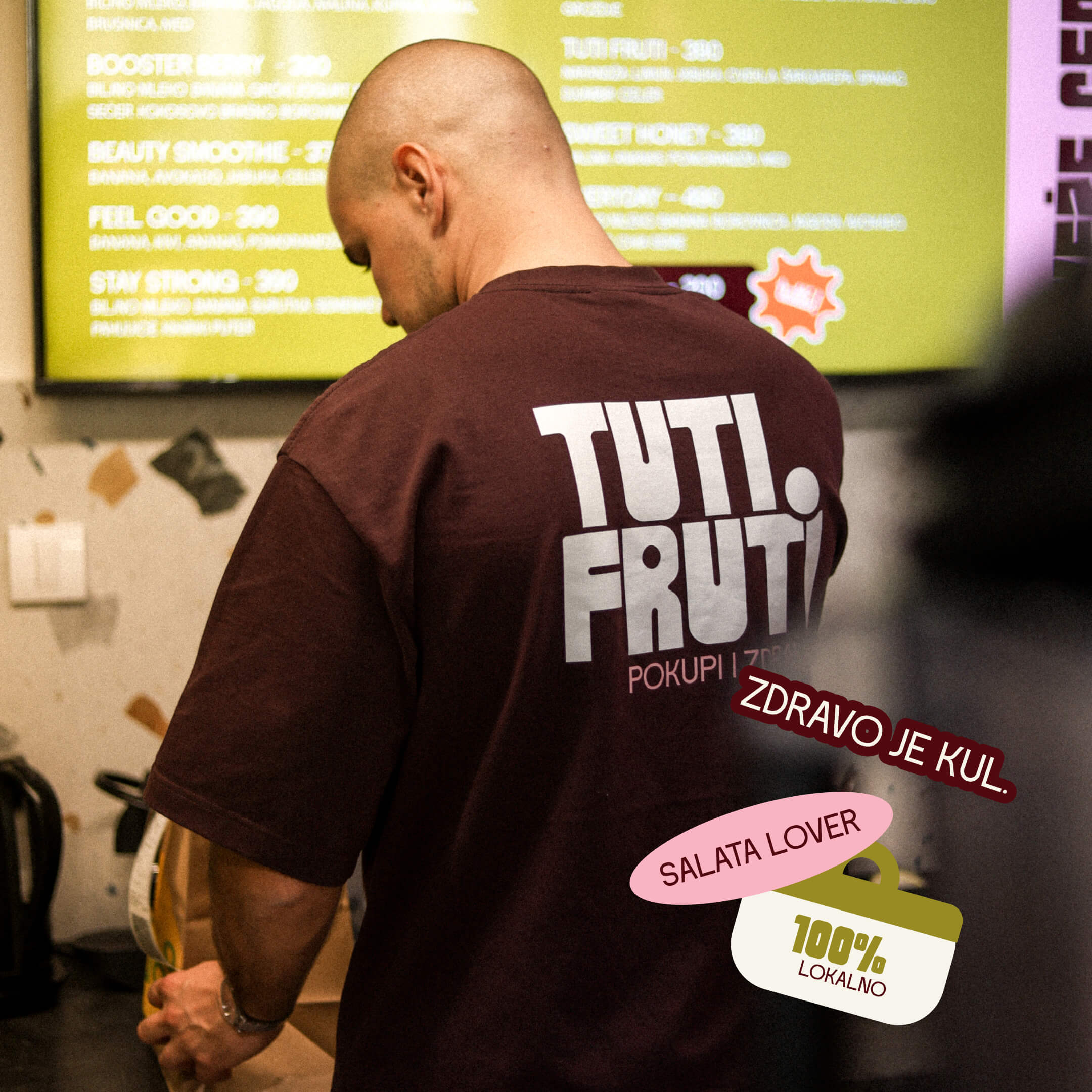
Very early in the process, we realized that Tuti Fruti isn't built around trends or carefully written marketing stories. The founders genuinely live the values behind the business. They train, they eat this way every day, they care about sustainability, support local producers, and believe that business should create a positive impact beyond profit.
That authenticity became our strongest strategic advantage.
Our role was to build a brand strategy around those values without making them feel performative. The identity needed to communicate quality, build trust, and create a distinctive position within the modern hospitality market while remaining flexible enough to grow across future products, services, and locations.
One Brand Across Every Touchpoint
The identity alone couldn't achieve that.
The website, photography, messaging, packaging, social media, and every future customer interaction needed to feel like they belonged to the same brand. The objective wasn't visual consistency for its own sake. It was creating a recognizable experience that people would remember, trust, and return to.
.jpg)

Building a Complete Brand Marketing System
We developed a complete 360° brand marketing system that brought together brand strategy, branding, art direction, content creation, website design, UX, and communication into one connected experience.
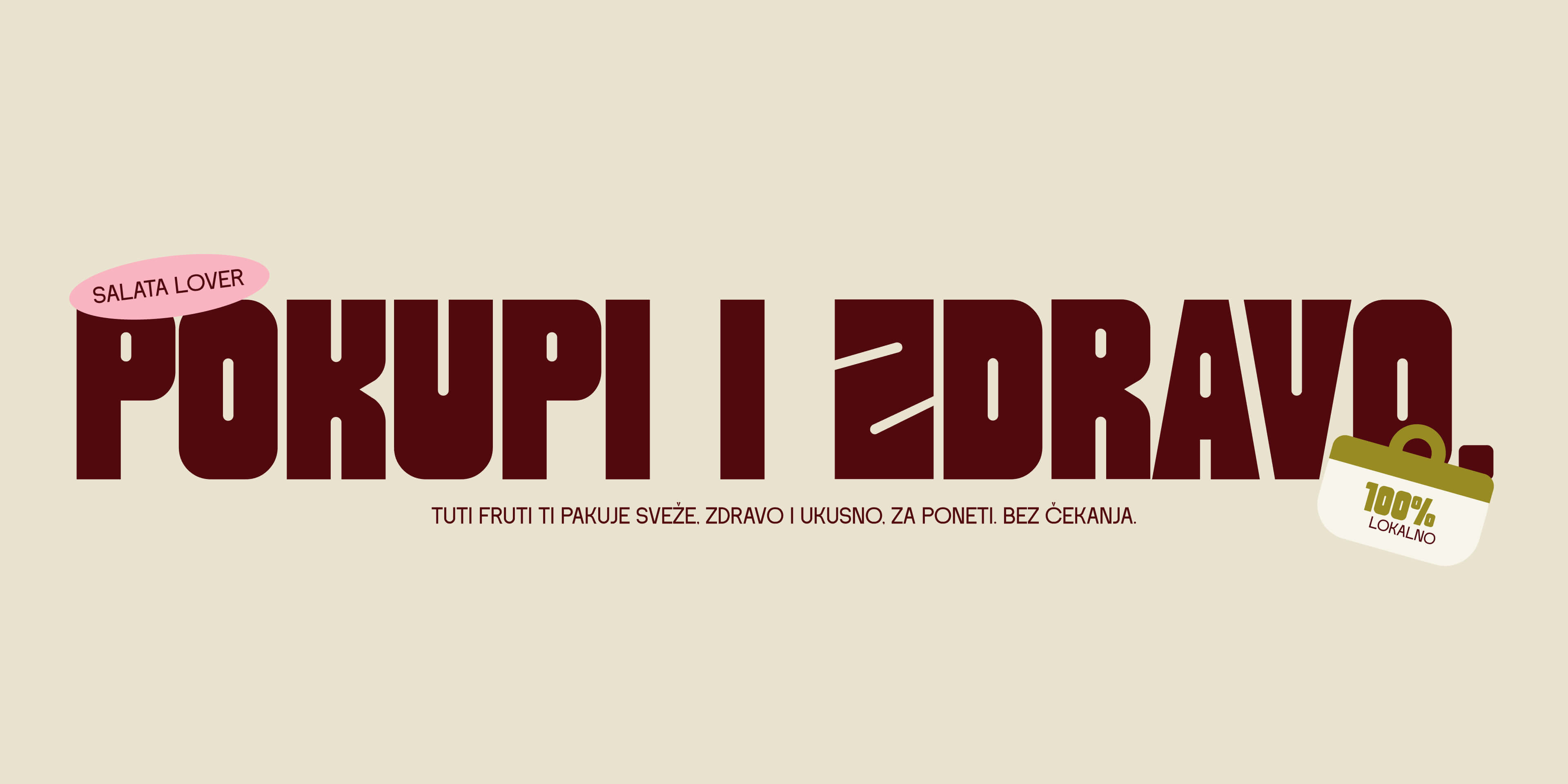
The visual identity combines bold typography with a color palette inspired by real ingredients and nature itself. The result feels urban without disconnecting from the products it represents. Confident without becoming loud. Flexible enough to support future growth while remaining instantly recognizable.
Communication That Builds Community
Beyond the visual identity, we defined the brand's tone of voice, messaging principles, and long term content strategy.
Every message was created to do more than promote a product. It was designed to invite people into a way of thinking. Double meaning headlines, customer focused copy, and everyday language became tools for building a community instead of simply generating attention.
The goal was never to create hype. The goal was to create familiarity. The kind of brand people naturally recommend because they believe in what it stands for.
Art Direction With a Purpose
We also established the creative and art direction across every visual touchpoint.
Photography, campaigns, social media, packaging, and future marketing materials were all developed within the same visual framework. Instead of creating isolated assets, we built a system that allows the brand to grow consistently while remaining immediately recognizable.
A Better Digital Experience
The website became another important part of the brand experience.
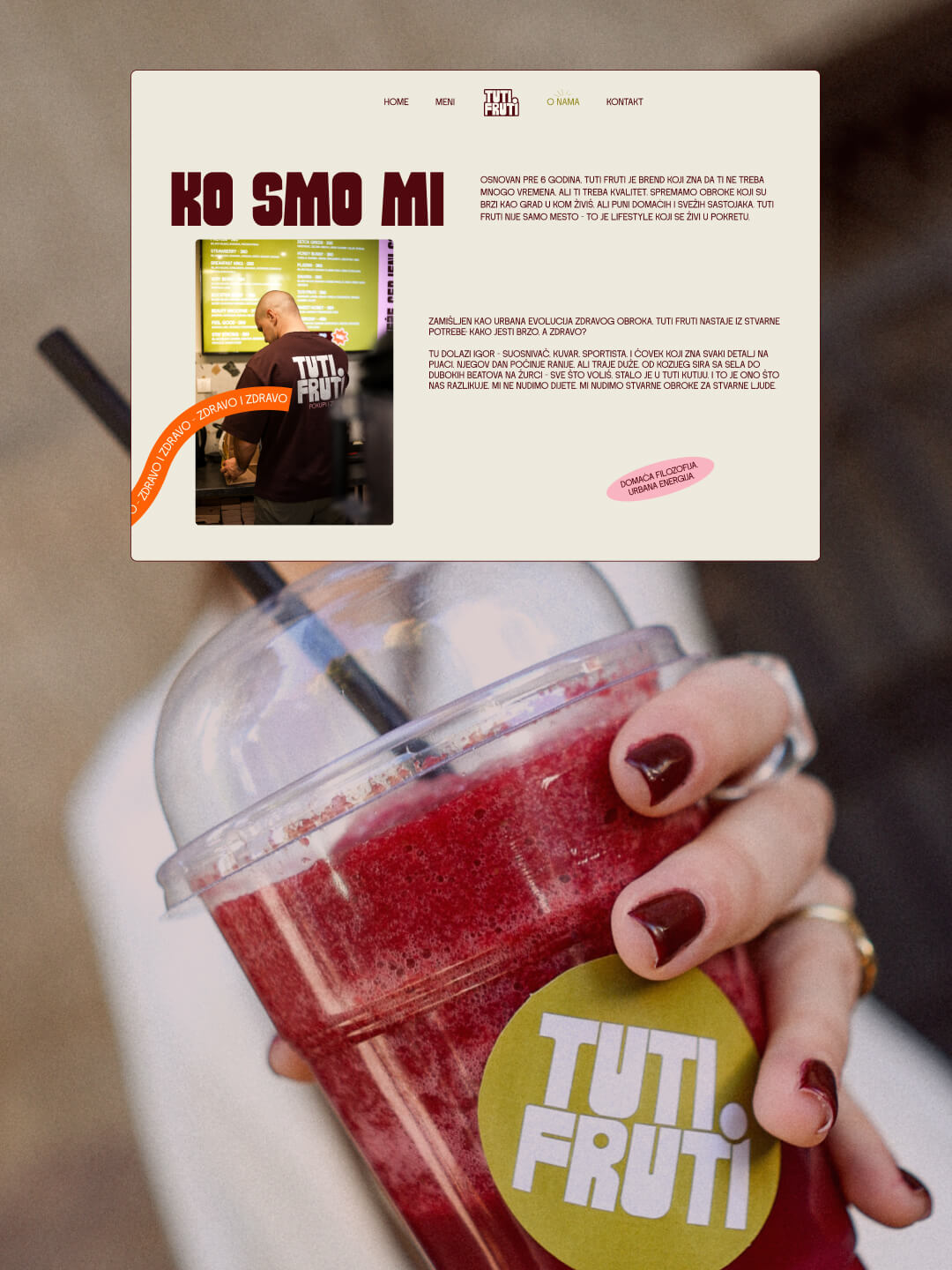
We redesigned it with a strong focus on user experience, simplifying navigation, improving content hierarchy, and creating a cleaner interface that reflects the maturity of the brand. Rather than functioning 2 as a digital menu, the website became an extension of the brand itself, making it easier for customers to discover products while experiencing the same clarity and confidence found across every other touchpoint.
Quality Begins at the Source
One of the strongest layers of the Tuti Fruti brand comes from its relationship with food itself.
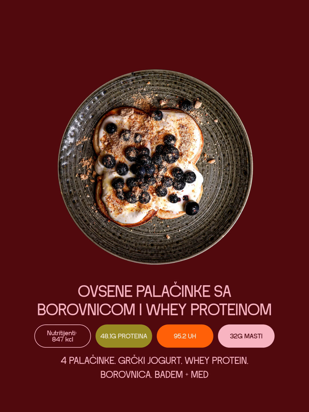
The team actively searches for small local producers, tests products, and builds partnerships with people who share the same standards. From goat cheese made in mountain villages to vegetables sourced from local farms and handcrafted peanut butter, every ingredient has a story behind it.
Their philosophy is simple. Share only what you genuinely believe in.That mindset became one of the strongest foundations of the brand we built together.


We didn't simply create a new visual identity. We built a complete brand marketing foundation designed to support long term business growth.
Today, every touchpoint speaks the same language. The identity, website, communication, content, and creative direction work together as one connected system, strengthening brand recognition and creating a more consistent customer experience.
Most importantly, the business now has a brand that reflects the people behind it. Honest in its values, confident in its communication, and ready to grow without losing the authenticity that made people trust it from the very beginning.


.jpg)

Let’s innovate together!