Solomei
Refined living, expressed through a considered identity
Solomei Moda is built around a discerning approach to fashion: curated pieces selected for quality, craftsmanship and lasting appeal. The brand is not about chasing what is new for the sake of it. It is about recognising the value of a well-made piece, a confident silhouette and style that remains relevant beyond a season.
Our role was to translate that philosophy into a cohesive brand identity and visual communication direction. We developed a visual world that feels assured, cultured and contemporary without abandoning the codes of classic fashion. The guiding thought was simple: the identity should frame the collection, not compete with it

Making restraint feel distinctive
In premium fashion, subtlety can communicate confidence, but it can also disappear into a sea of similar brands. Solomei Moda needed to feel timeless without looking dated, refined without becoming distant, and recognisable without relying on graphic excess.
The identity also had to work across very different settings: editorial imagery, product communication, social media, packaging and physical brand applications. It needed enough flexibility for different collections and fashion labels while maintaining one unmistakable Solomei Moda signature.
An enduring wordmark
We developed a wordmark that balances the heritage of traditional serif typography with modern proportions and uncluttered layouts. The result takes its cues from longstanding fashion publishing and understated luxury, while remaining functional at different scales and across digital and physical formats. The visual system also makes room for carefully placed editorial copy rather than relying on a logo alone.
A palette informed by material and place
The brand palette draws inspiration from tactile, natural surfaces: leather, stone, sand and wood. Tones including Espresso Umber, Travertine Taupe, Linen Sand, Ivory Silk and Midnight establish a quiet premium backdrop. These colours are deliberately supportive; the clothing, craftsmanship and imagery should attract attention first.
Art direction and fashion storytelling
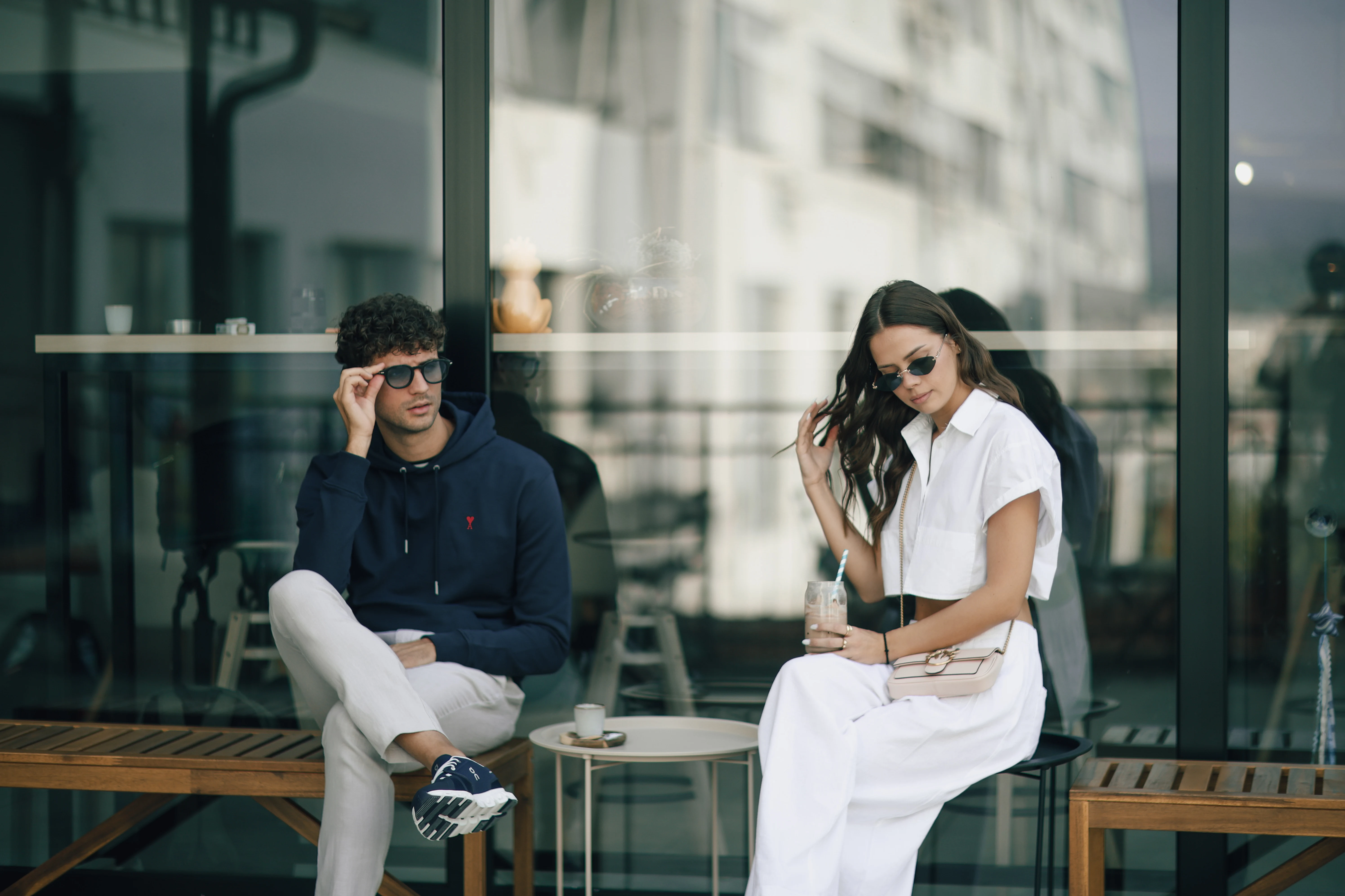
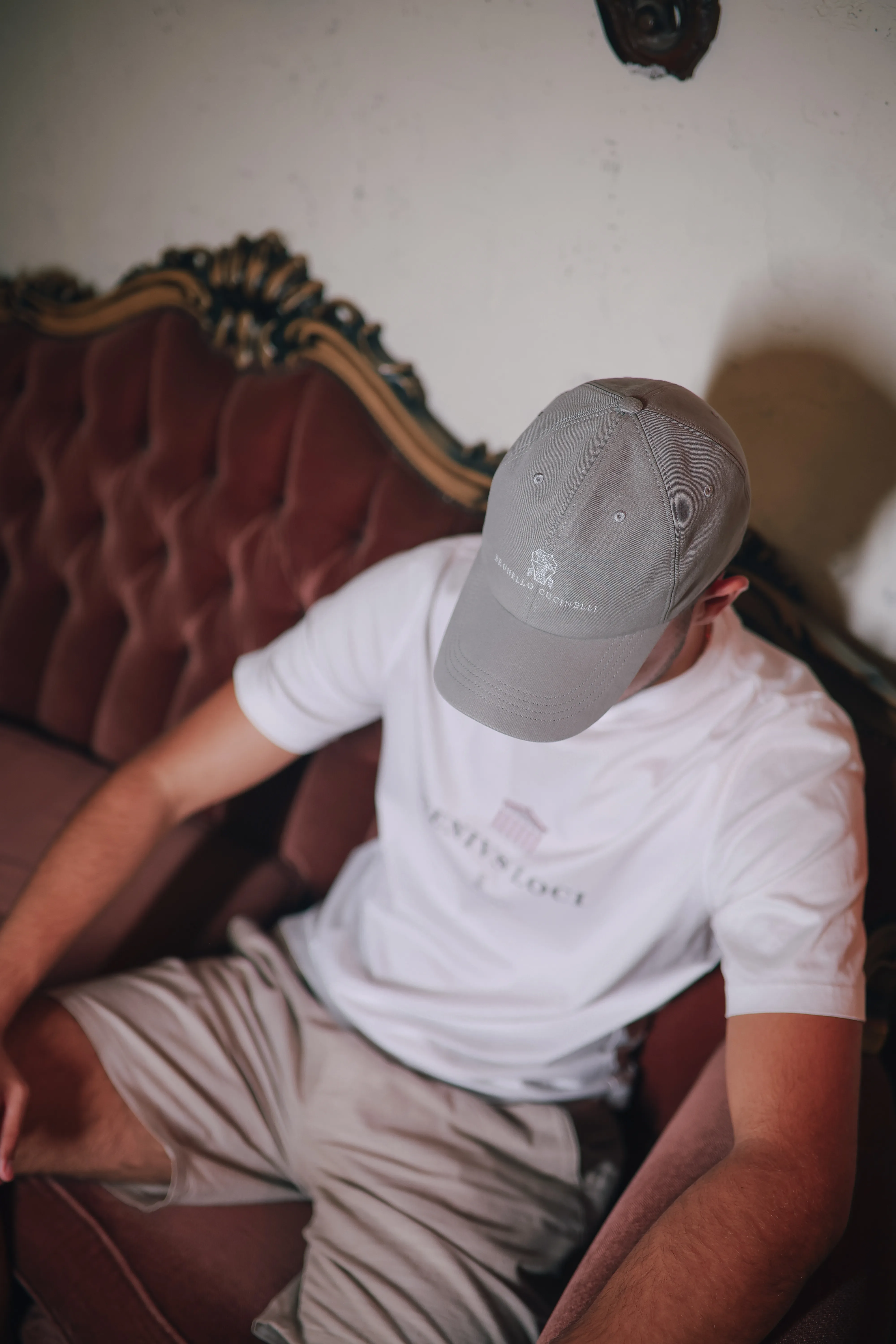
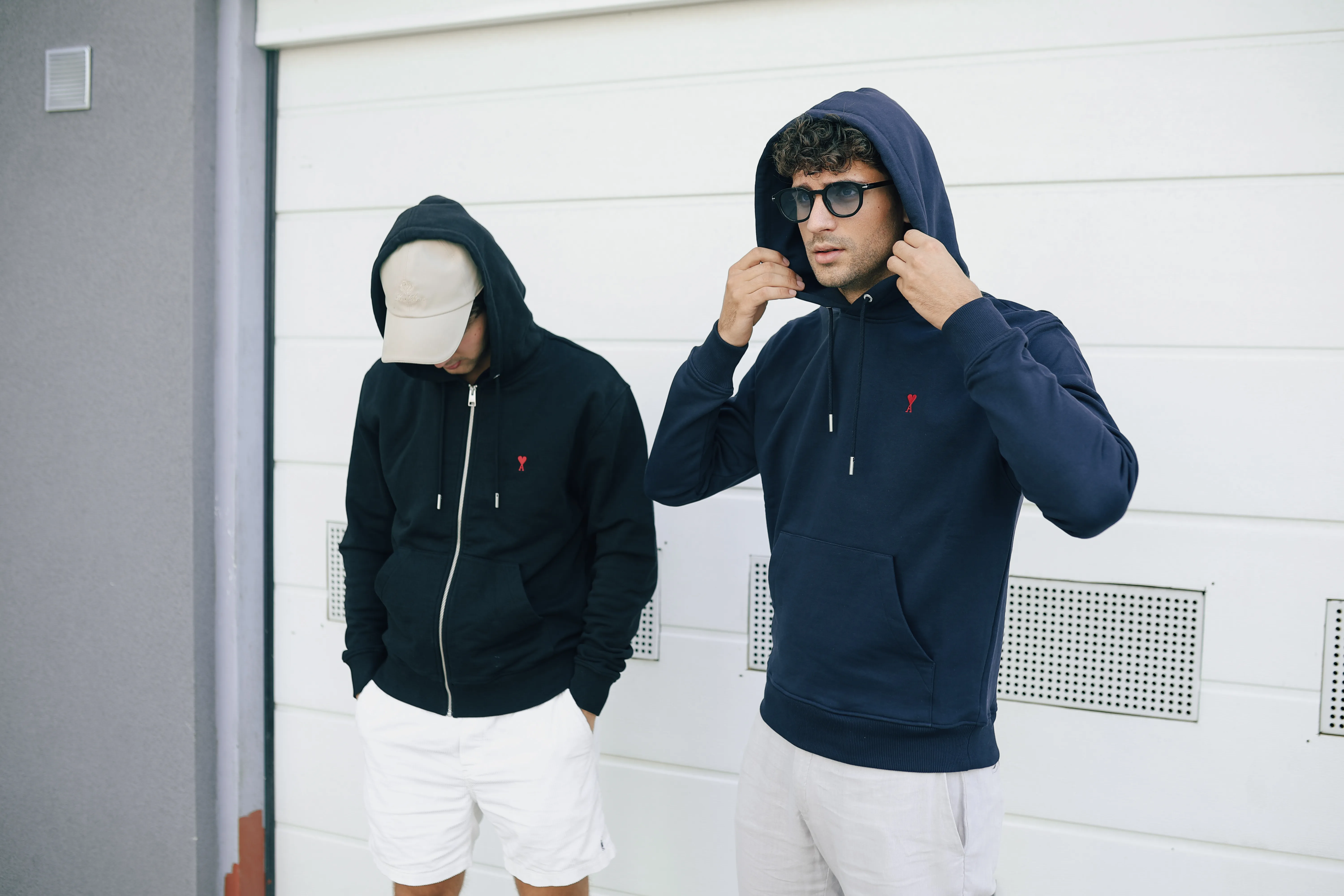
We explored an editorial visual language rooted in texture, movement, architecture and understated styling. The layouts combine considered serif type with more functional supporting typography, creating a balance of classic and contemporary. Messaging such as “Refined living” and “Curated for those who know” reinforces the brand's emphasis on taste and discernment rather than trends.
Packaging and brand applications
The presentation extends the identity into shopping bag concepts, embossed treatments, product and campaign layouts, and social templates. These applications show how the same visual principles can maintain consistency across the customer journey, from discovering an item to taking it home.
Solomei Moda has a distinctive, adaptable visual identity built around a clear philosophy of curation and longevity. Instead of treating each collection or channel as a separate design exercise, the brand now has a coherent graphic and editorial foundation through which to present the pieces it selects

FAQs
How can a fashion brand carry its identity across packaging and social media?
A reusable visual system lets product photography, tags, bags and social content feel connected without identical layouts. Solomei Moda’s identity was demonstrated through those applications, including embossing and shopping-bag concepts. That is the same principle behind our Brand Foundations work: one recognisable idea across touchpoints.
How can a quiet luxury fashion brand look distinctive without loud branding?
Quiet luxury branding can build recognition through typography, proportion, material cues and repetition. For Solomei Moda, 134 Agency used a refined serif wordmark, restrained layouts and warm natural colours to create an identity that supports the clothing rather than competing with it.
What did 134 Agency create for Solomei Moda?
134 Agency developed Solomei Moda’s visual identity and creative communication direction. The work covers a wordmark, colour palette, editorial design system and applications shown across packaging, social layouts and product storytelling. The presented physical applications are design concepts unless separately confirmed as produced.
What inspired Solomei Moda’s visual identity and colour palette?
Solomei Moda’s palette draws on tactile natural materials such as leather, stone, sand and wood. Paired with classic serif typography and contemporary spacing, those references support a curated-fashion positioning focused on craftsmanship, long-term appeal and understated confidence.

See you
at 8:00.
Laptop optional.
Swimsuit recommended.
Excuses not accepted.
Let’s innovate together!