Plod
PLOD is a premium juice brand built on generations of fruit growing and traditional juice production. Rooted in carefully cultivated orchards and authentic local varieties, the project transformed a long-standing family craft into a contemporary brand designed for today's retail and hospitality environments.
Our role was to develop the complete brand identity, packaging system and visual direction, creating a brand capable of growing far beyond its initial product range. Rather than treating each juice as an individual product, we built a flexible identity where every future flavour strengthens one recognisable brand. The result is a visual system that feels confident, contemporary and instantly memorable while honouring the quality and heritage behind every bottle.


PLOD entered a category where purchasing decisions are often driven by fruit varieties, colourful illustrations and descriptive packaging. In most cases, the product becomes the hero while the brand quietly stays in the background.
Our objective was to build the opposite perception.
From the very first glance across a shelf or restaurant table, people should recognise and remember the brand itself. Every bottle needed to reinforce the name PLOD as the strongest visual asset, creating consistency across future products while giving the business a scalable foundation for long-term growth.
Alongside recognisability, the identity needed to communicate craftsmanship, premium quality and contemporary aesthetics, allowing the brand to naturally find its place in carefully curated retail spaces, concept stores and hospitality environments.
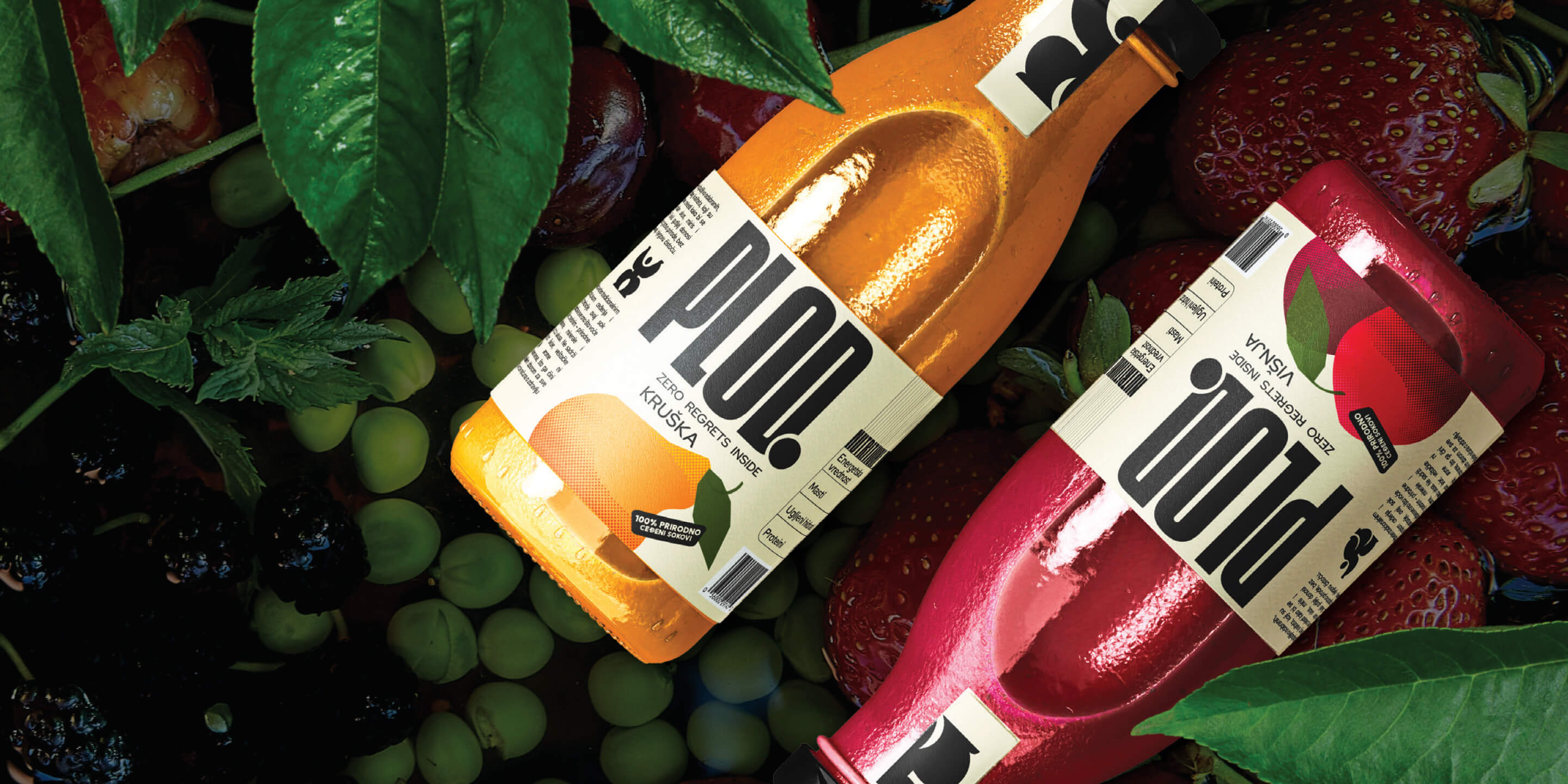
We built the brand before designing the packaging.
Our research explored consumer behaviour, category conventions and visual patterns within premium beverages. One insight quickly became clear: fruit names often dominate the conversation, while the brand remains secondary.
This became the strategic opportunity.
Every design decision was made to establish PLOD as the primary visual element, allowing the brand name to become familiar with every new bottle introduced to the market.
A scalable packaging system.
The identity was developed as a flexible brand architecture capable of supporting future flavours, seasonal editions and product extensions without sacrificing consistency. Rather than creating individual labels, we designed a recognisable system where every new product naturally strengthens the brand as a whole.
This approach transforms packaging into a long-term branding tool rather than a single product application.
Scandinavian simplicity with distinctive character.
The visual language combines clean compositions, generous white space and a restrained colour palette inspired by Scandinavian design principles. Carefully selected accent colours create immediate differentiation between products while preserving a calm and premium shelf presence.
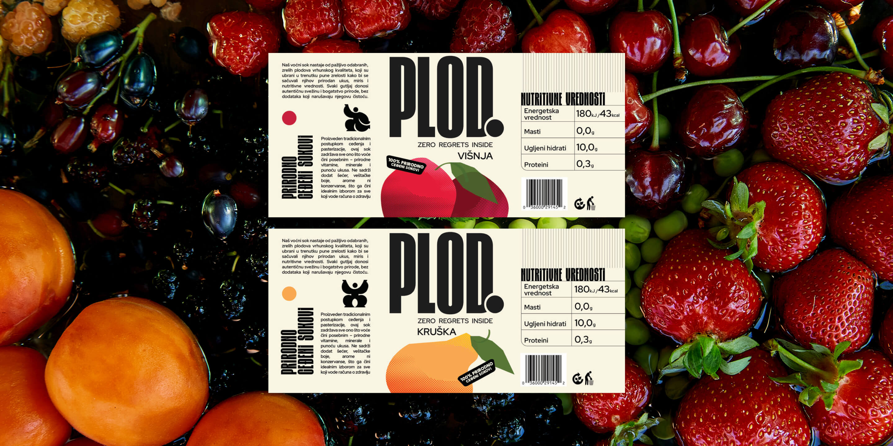
Each flavour is further distinguished through custom illustrations that introduce personality, celebrate the origin of the ingredients and give every label its own recognisable character within the broader visual system.
Typography designed for recognition.
Typography became one of the strongest brand assets. Bold, confident letterforms establish PLOD as the unmistakable focal point of every label, while a clean supporting typeface introduces balance, clarity and timelessness. Together they create a visual hierarchy that guides attention naturally and strengthens brand recall across every interaction.
PLOD launched with a visual identity that immediately positions the brand as the hero of the experience. Every bottle contributes to a growing recognition system where products strengthen the brand, and the brand strengthens every future product.
The combination of strategic branding, packaging design and thoughtful visual direction created a premium identity that feels equally at home in carefully curated retail environments and contemporary hospitality spaces.
More importantly, PLOD established a foundation for long-term growth. Instead of designing a single label, we created a brand system capable of expanding across new flavours, new collections and future product categories while continuously reinforcing one memorable name.

See you
at 8:00.
Laptop optional.
Swimsuit recommended.
Excuses not accepted.
Let’s innovate together!